case study
Pivoting to solve the right problems so that users can find the right thing
How I stopped us from building the wrong solution to solve the wrong problems.
case study
How I stopped us from building the wrong solution to solve the wrong problems.
SLS is Singapore's national learning platform for students and teachers across the country. Search was broken. The team's plan was semantic search, a year in the making. I came in and challenged it.
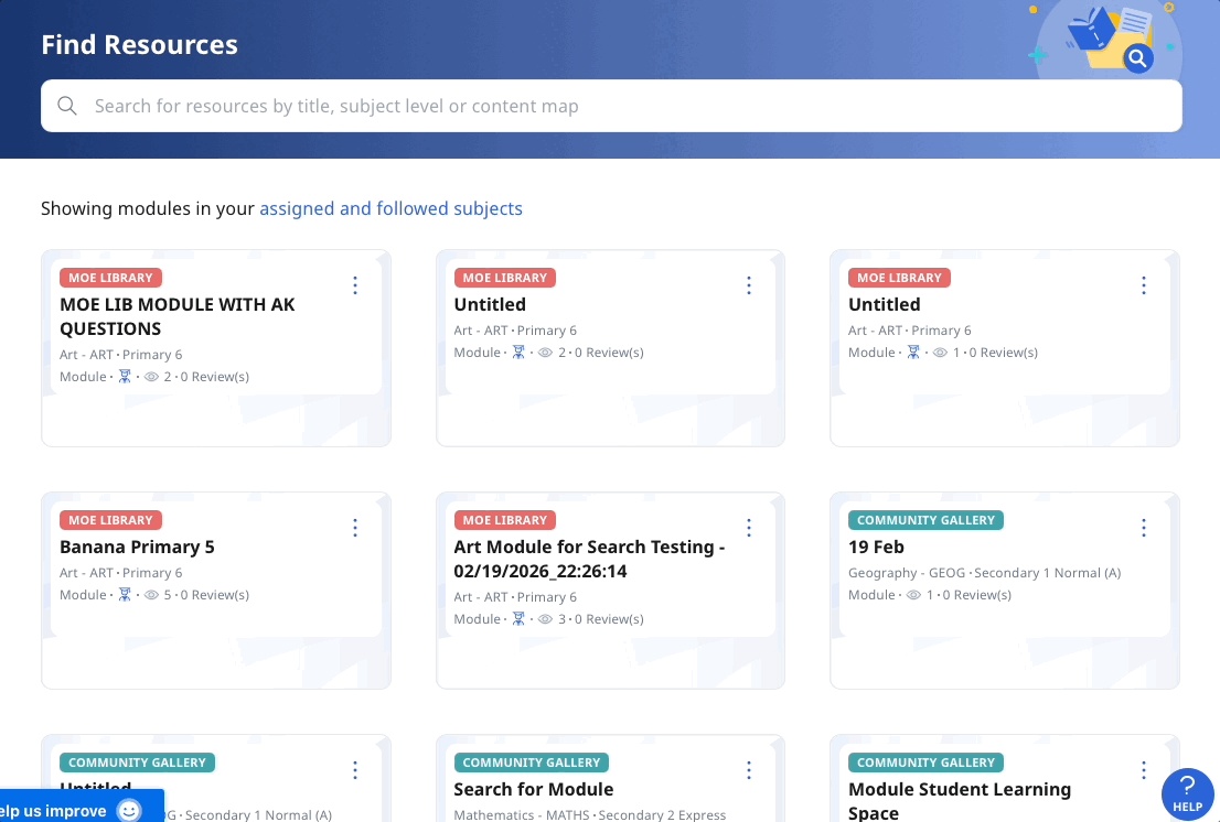
Our new search UI reads typos and reduces cognitive load for filtering.
of 30 test users preferred the new design
valued filtering by questions, an existing feature that was buried
resource-related build with data hooks to validate success
I pulled search logs, reviewed user feedback, ran a quick survey, and read academic literature on child-computer interaction. When direct user access is limited, published research on common behaviours like search fills that gap fast. This shaped everything that followed.
What I found made the semantic search plan hard to justify.
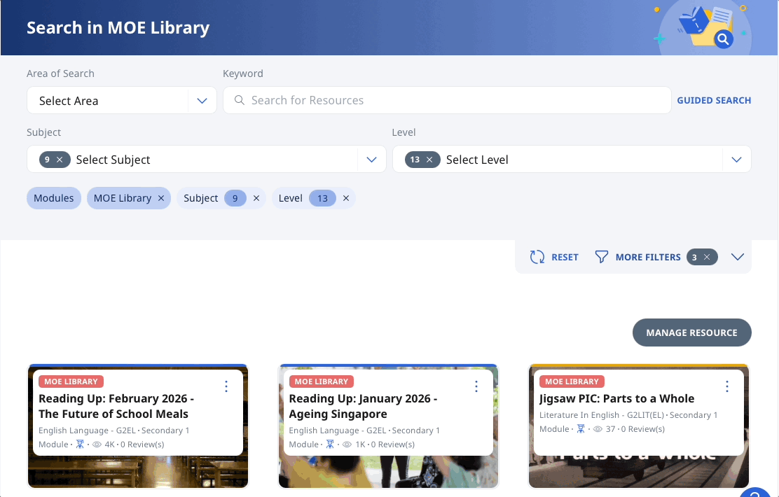
Our UI forced users to filter before they pressed search. The opposite of how users expected it to work.
rated our UI complicated or very complicated
results if users searched for interactive digital textbooks vs IDT
filter combinations a user might need to try just to find the right module
The literature also showed that children's developing motor and literacy skills led to more typos. Our exact keyword matching punished them for it.
Then there was the problem nobody had caught. A national policy shift had moved students to subject-based banding but our metadata hadn't kept up. Students searching Secondary 1 Mathematics G3 found only 4 out of 62 modules. Every module was still tagged "Secondary 1 Express." No search algorithm would have fixed this.
The gap between how users searched and how content was tagged was costing other teams' work its visibility.
Semantic search had been sold to senior management as the answer. When I sat with them, I realised their concerns matched exactly what I'd found. They knew users were failing to find things. They just didn't have evidence for why.
I mapped every problem against what semantic search could realistically solve and walked through real failing queries. The academic literature reframed typos, acronym matching, and vocabulary mismatches from minor annoyances to foundational issues affecting most users. Getting these basics right would do 80% of the heavy lifting.
"Oh, I see. Semantic search was actually just one small part of it."
— Product Teammate, after my presentation
Mid-project, a proposal came in for AI-generated module recommendations. I hypothesised it would fail because I saw we hadn't dived deeply enough into users' journey in selecting resources, or what content AI could use to make its recommendation.
Rather than flag this without evidence, I embedded the question into my usability study. The information users needed to evaluate a module was missing from most content. Nothing for AI to pull from.
That killed the recommender. This data is seeding other future builds, without needing a separate study.
I made the case for building data hooks directly into search to compare user behaviour before and after launch, with senior management's support. This way, we can keep iterating rather than assume success.
Leadership now wants this search revamp as the reference model for all search across the system.
"Thought it is opportune to convey a special note from [key stakeholder]. He says that the revamped search feature is very well done. Keep up the great work!"
— Product Lead
Scope creep is real, but so is the challenge of finding users. Knowing how we shaped product direction by adding the AI module recommender question into my usability study, I might vibe code rough explorations of search card redesigns for users to try. Even a loose early sensing of what direction to would give us a stronger foundation going into this redesign in the future.
I'd also have pushed harder on the data hooks. When we built, the team was comfortable assuming that any interaction signal indicated relevance. But if we had captured more granular data about specific actions users took, we'd know how users were actually engaging with the results, while informing our future card redesign.