case study
The team thought Browse was one launch and done. Research changed that.
Research that grew a roadmap and gave the next team a foundation to build it from.

case study
Research that grew a roadmap and gave the next team a foundation to build it from.
Browse had existed before. Users liked it. Then a previous decision-maker took it down, and the requests to bring it back never stopped.
The scale made this complex. More than 450,000 students across primary schools to junior colleges. Over 40 subjects, many offered across 2 to 3 curriculum bands and multiple year levels. The information architecture had to hold across all of that.
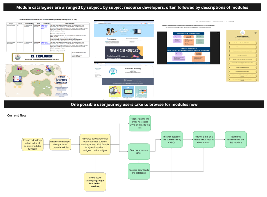
Teams across more than 15 subject areas were building their own workarounds to solve the same problem we used to but no longer did. Here we note some of them down with the users' journey to the catalogue and their chosen module.
My discovery quickly surfaced something the product team hadn't fully mapped: content maps, owned by the curriculum division, were information architecture central to how Browse would need to work. These "translated" the curriculum for our site, and all publicly available modules were tagged to it.
I built out that picture proactively. It gave the team, including my leads, enough shared understanding to start cross-divisional conversations about updating these maps. That meant joining curriculum team meetings, understanding how they were already tackling discoverability, and framing our work in terms that made sense to them.
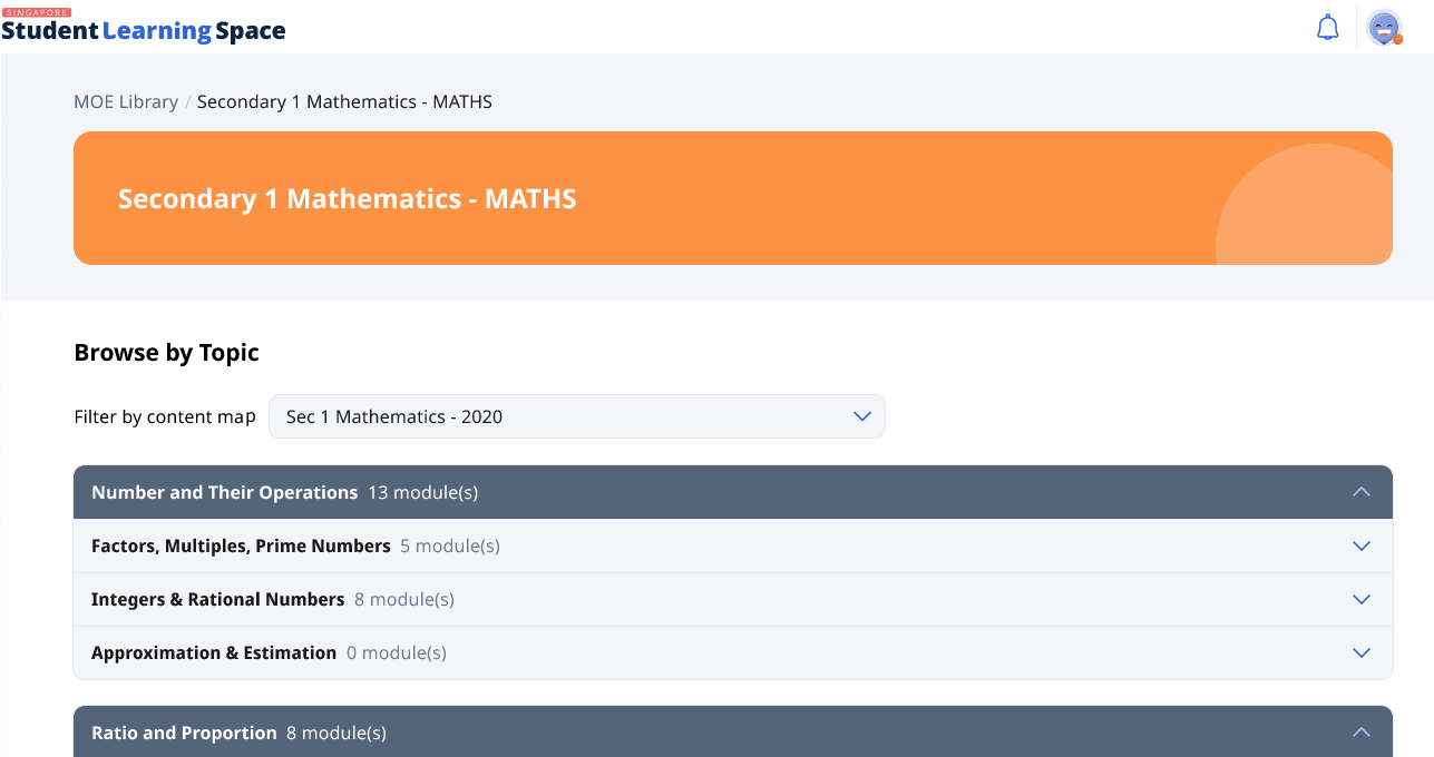
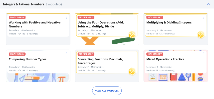
This was an early prototype that we used for research. Content maps formed the catalogue's information architecture, but they weren't always presented this way by topics and subtopics.
I ran usability testing and surveys with students, teachers, curriculum specialists, content map owners, and members of the original team who built the first Browse feature.
Only 2 out of 9 child participants made it to the right subject catalogue and category during testing.
Worryingly, some of our participants didn't understand what MOE Library was for in the first place! This was a piercing insight that would remain with us in other pieces of our design work.
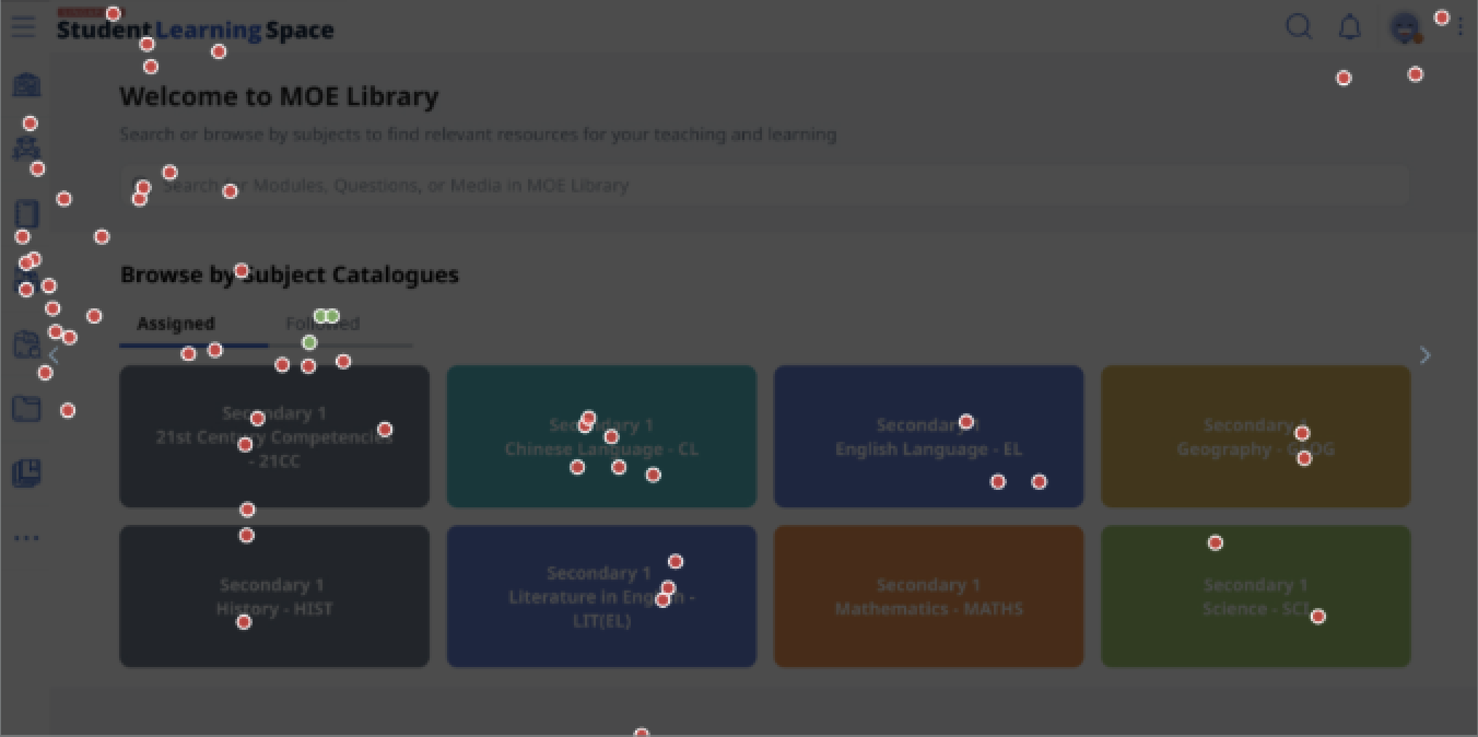
The click map for 4 child participants who couldn't find modules for a math topic, let alone enter the math catalogue.
This card component made sense elsewhere in the design system, but here it wasn't visually communicating that this was a place to browse for modules.
"Can you make it look more fun?"
— 8 year old usability test participant
We left the research wondering why reception was, as a kid would've said, mid. Why didn't students see the need to use this in their revision? How were students revising on our platform? The avid advocacy caused us to miss these questions earlier, but my research surfaced them.
"People kept asking for Browse... I didn't expect they would be so lukewarm about this."
— Product Teammate
Before my research, shipping Browse was assumed to close the problem. After it, there was alignment that more effort was needed. The roadmap made room for further iteration.
The next team carved out dedicated time for in-depth usability testing with students around revision habits, follow-up research that is rare on this team.
My discovery work into the metadata backbone of these modules also kickstarted crucial conversations we needed to have with our curriculum colleagues. Our collaboration was crucial to students having a positive experience browsing.
Starting with 8 weeks for design left us with a tight turnaround time for testing, learning, and iterating. It also meant we had less time to plan for collborating with other key service partners, such as our curriculum colleagues. I'd push for a realistic timeline before work starts, so that we can solve these problems upstream.